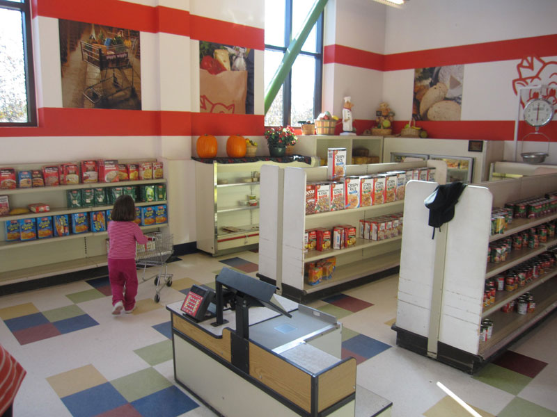
Supermarkets can be designed to offer shoppers the best experience which in turn means they shop more hence more profitability to the supermarket owners.
Break of monotony.
Supermarkets are mostly on large floor space spans. These spans, if not carefully considered, can end up looking like warehouses with shelves. To prevent this, the architectural design can be manipulated to create different niches each with its own feel. For example, the fruit and vegetable section can be designed to have allot of wood finishes in the ceiling, shelving structure and natural floor materials for the wall.
This gives a natural, fresh, relaxed feel, which makes the shopper more comfortable, hence higher chances of more sales.

Toy and baby sections can also be designed to appeal to kids.
The height of shelves can be optimized to enable kids reach the top. The floor and wall colour scheme can be designed to look interesting for the young ones.


The bakery section can utilize use of natural materials and carefully selected lighting intensity to create an aura of freshness.
Use of wood, red brick clay tiles and stone surfaces is most appropriate.

Use of uplighters for lighting is also a good method of ensuring shoppers are comfortable.

Shelve shape.
A break in the monotony of shelf shape is also a good method of ensuring shoppers to not get bored while shopping. Items on sale can be placed here so that they are more noticeable.


False ceilings with downlighters.
The roof can also be used to emphasize various sections, and also be used to hang downlighters which ensure only lighting of the desired intensity points to the targeted product.

Location of products.
Fresh products such as the bakery and fruit and vegetable sections are best placed near the entrance. This has the effect of giving the impression of freshness to shoppers, hence eventually spending more time in the supermarket and spending more.
Width of corridor walk way.
Corridor space should be wide enough to prevent people bumping on each other, creating distractions. 1.5 to 2m wide space is good enough for the corridor.
Items which relate to each other, eg bread and milk, can be located far from each other so as to create a situation whereby the shopper walks to and from these points, in effect, viewing more products which will then set in impulse buying hence more sales.

The bakery section, apart from appealing to the eye on the delicious baked foods on display, also uses the sense of smell to augur in the message to the shoppers, hence more sales.

Foods that require refrigeration can be kept in the rear at the farthest from the entrance so as to use less energy in cooling.
With the above considerations, your architect can then design a supermarket that is alive and vivid to the shoppers,to avoid the drab industrial look.

This will ensure a better shopping experience and higher sales.
Francis Gichuhi Kamau, Architect.
Comments
One response to “How Supermarkets in Kenya can be designed for maximum profitability.”
Awesome will try your designs in my own grocery store😊